Acrylic Paintings : Painting from Memory

My home county, Lebanon, used to be known as the “Switzerland of the Middle East” due to its civility, peace and democracy. This was especially true of the city I grew up in – it was a city of love, understanding and tolerance, where people of different faiths and cultures could peacefully coexist together. Moving about in the happy hustle and bustle of the city, I would encounter people of all sorts of different faiths living, eating, laughing, and enjoying life together in harmony. At this time, differences were a cause for celebration, not violence.

As children, we used to go to the villages and valleys surrounding the city for fun and adventure, as well as serenity. There were endless gardens and valleys stretching out with the abundance of nature for us to play in. I remember waking up at 4:30 in the morning with the other kids to walk for hours in the valley, to reach the orchards and the gardens. We would gather all sorts of fruit – peaches, cherries, pears, grapes – anything that we didn’t have, we would simply wander into the neighbouring gardens to pick, like blackberries and figs. We would spend the whole day picking, and lug home baskets spilling over with fruit. We would arrive home exhausted but entirely happy, rejuvenated by the outdoors. Upon arrival, we’d wash and eat even more fruit, even though our little tummies were full with all the fruit we had stuffed down our throats while picking!

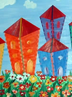
I evoke these happy times in the bright paintings Escape to Affection and Escape to Happiness. However, the time in which they were painted was the complete opposite of this idyllic childhood. Instead, it was a time of great darkness. I had suffered three tremendous blows: the loss of my dear mother, the loss of a great job, and an alarming health scare. I felt completely alone and broken,  as if I was lying shattered on a cold and dark floor after experiencing a long, terrifying free fall. There was no exit, and hope was difficult to find – my thoughts turned morbid, and it seemed that the only escape was death.

But I managed to find another escape: art.  It was painting that helped me escape this period of darkness and that helped me heal – in particular, it was painting images and scenes inspired by my childhood, diving into these happy memories, vividly recalling a time things were easier, brighter, bursting with possibility just as our baskets had burst with fruit. I realized that the happiness of this time could be found once again through painting; art gave me the healing power to collect the pieces, stand up, and move forward to build a better future.

I put my memories to the brush, and translated them into the bright colours, the beaming sun, and the enchanting gardens. These paintings have an air to whimsy to them, particularly in the buildings and shapes; I want the observer to feel, looking at it, as if they are in a wonderful dream from which they almost don’t want to wake up, happily escaping into the colours of memory and imagination.


Canadian Landscapes – Vibrant Colours

Since moving to Canada, autumn has become my absolute favourite time of year:  the vibrant colours that abound leave me breathless, and I am often overcome with the beauty of season.  The air is electric with inspiration, ringing out in tones of deep reds, brilliant oranges, and stunning yellows…a chorus of colours.

In Lebanon, fall is completely different. When the season comes, the leaves change to pale yellow (nothing like the depth and shades of yellow here), even beige. It wasn’t until I came to the feast of colour that is the Canadian autumn that I realized how starved for colour the Lebanese autumn was.

It doesn’t matter how many times I’ve watched the seasons come and go: each fall I am still captivated. I will drop anything to go out and wander among the leaves. A few years back, I took a drive from Toronto to Montreal in the height of the season. It was one of those idyllic, perfect days, where every moment seems charged with significance, one of those days where you are acutely aware of the beauty of the world, and you realize, with a start, that you are truly happy in the moment.

The scenery was truly awe-inspiring: I couldn’t get enough! I was drunk on colour, dizzy with the beauty that surrounded me. We pulled over in Kingston, ON, for an hour so that we could truly take it in, and not just through the car window. I took countless photos, over and over, trying to capture the perfection.

It is experiences like this that inspire me to paint works such as Warm Canadian Day. I recall that day with much fondness: painting is a way for me to return to that day, to those feelings of happiness and joy, to the fiesta of autumn. Though I do take pictures, as I mentioned, I cannot paint from photographs. I prefer to draw from memories and mental images: I find the works are then infused with a genuine feeling, tinted and shaded with the authenticity of my own experience.  I find I am more able to make the piece my own.

Geometrics Acrylic Paintings – East vs West

When I was a child growing up in Lebanon,  I was entranced by the beauty that surrounded me.  It was an intoxicating whirlwind of both natural and manmade wonders, from the forests to the architecture and artwork of my town.  In my paintings, I often refer to scenes, images and memories from this rich and evocative childhood home, as evident in my 5-piece Geometric Series.

I can remember  going to church and being mesmerized by the colourful patterns adorning the walls and windows – I was drawn in by the  intricacy of the artwork, and the bright colours that lit up the space. When I walked into rooms or buildings decorated in the traditional Arabic style, I was  struck with similar sensations: the patterns and shapes were like those I saw in church, but still with a style all their own, laden with their own unique mystery and power.  The realization that these shapes and images were used within both cultures, Christian and Muslim,  moved me profoundly – in art, there was a unity, there was cohesion, there was, just as the intricate patterns suggested, a harmony that could be found.

These encounters had a lasting impression on me; they  shaped me as an artist and as a person.  When I came to Canada,  I called these memories up from the depths of my being, and began to paint. What came from this is my Geometric Series. In many ways, what I have attempted to produce in this series are pieces that reflect a merge of the two cultures I experienced. I have engaged with iconography of both cultures, such as the cross and the octagon. While these paintings can be hung separately,  they were designed as a series to reflect a unification of two cultures within the artistic realm.

The shapes that I have engaged with are further shaded by memories of the natural beauty that was my playground, my backyard! In the Middle-East, there is a popular flower  that  I knew as a marguerite – in the English speaking world, you would know it as a daisy. These yellow daisies grew very high –as a child, they were almost taller than me!  Around Easter, we used to gather up these flowers and cook our eggs with them; the daisies turned the eggs a bright, yellow hue, and infused them with a unique and delicious flavour. My nod to this experience can be seen in both the use of the bright yellow colour and of the petal shapes within this series.

For me, art and the process of creation come from a very genuine place within me;  always behind my paintings is the desire to share a story. The pieces in my Geometric Series came from recalling scenes from my childhood; they are an attempt to evoke some of the same feelings of wonder and joy I had when surrounded by such powerful images and scenery.


Related Paintings :

Don’t Brush It Off: Taking Care of Your Paint Brushes Tips

clean brushes

Accomplished and novice painters alike know the importance of proper cleaning and maintenance of paint brushes. Taking the little extra time to properly clean your brushes after you paint will extend how long you can use them, saving you from continually having to buy new brushes. All it takes is a little lukewarm water, some mild soap, and a bit of patience.

Finished painting for the day? Follow these do’s and don’ts so that your next painting session will be just as enjoyable as the first!
DO:

  1. Wear gloves if you worry about the toxicity of your paint or the sensitivity of your skin. Pay attention: if the paint is staining your skin causing your skin to crack, use gloves!
  2. Use a clean, soft cloth or tissue, wipe off any excess paint. The best way to do this is to gently squeeze the bristles from the ferrule edge outwards to the tip with your fingers or a cloth.
  3. Rinse the brush. Oil paints require rinsing in turpentine or oil. Water-based mediums can be rinsed in lukewarm water.
  4. Wipe the brush on a cloth to remove the last of any paint.
  5. Wash the brush gently with a bit of mild soap or gentle dish soap. If your paints aren’t toxic, work up a small lather of soap and gently scrub the brush in your hands. Otherwise, dab the brush in soap (Gently, gently!) and make a lather in a container.
  6. Rinse, repeating until the water runs clean and there is no trace of any colour still coming out. Make sure there is no paint left within the bristles. Certain paints may permanently stain the bristles over time, but the brush will be perfectly fine to use – as long as you make sure to remove any lingering paint.
  7. Remove any leftover soap by doing a final rinse in clean, lukewarm water.
  8. Gently shape the head of your brush into its original shape with your fingers.
  9. If your brush is too misshapen to be shaped by your fingers, wrap a piece of toilet paper around the bristles while they are still wet. As the paper dries, it will pull the bristles into shape by contracting around them.

DON’T:

  1. Pull on the bristles to get excess paint out – pulling on bristles will tear some of them out.
  2. Use hot water. Hot water can damage the ferrule by expanding or loosening it, which can then cause the bristles to drop out.
  3. Leave your brushes to dry bristles down. If your brush dries head down, the bristles will splay our and dry misshapen. Put it handle-end first in an old yogurt container or jar.
  4. Let acrylic paint dry on a brush. Acrylic pain is water-resistant when dry – if you let it dry, it’s not coming off!
  5. Leave brushes standing in water. This is not proper care and can ruin them.
  6. Force paint out of brush using high water pressure. This will weaken the bristles, and can cause them to loosen and fall out. Rinse gently several times as opposed to blasting the brushes once.

PAINTER POINTERS:

  • Use separate brushes for your oil paints and for water-based mediums. It’s also important to use separate brushes for masking fluid and varnish.
  • Natural bristle brushes can stiffen and lose flexibility. If you desire, you can soften your brush: after cleaning it, dip it in a bit of the oil you use as a medium.
  • Are your brushes out of shape? Sometimes you can reshape synthetic brushes by soaking them in hot (not boiling, but hot) water.

Bruce Garner’s Joy Sculpture

Nestled in Sparks Street Pedestrian Mall , Ottawa’s pedestrian street, there is a copper sculpture : 4 figures, 3 adults and one child, hold hands in a circle. Their entire bodies are thrown back, their heads are up and the child and a female figure each have one leg off the ground, pointing up. Their bodies are smooth and unadorned; the only material is copper. One does not need to read the title of the piece to feel the tone of it at once: Joy.

Bruce Garner’s Joy is a beautiful, evocative sculpture. Looking at it, your heart is immediately swept up in the gestures of their hands, in the arches of their backs which push their chests out as if they were singing, in the dancing movements suggested by their bodies, right down to the toes pointing upward. To me, the piece is even more poignant for its location: though Sparks Street has many delights including boutiques, greenery, and benches, it is surrounded by old banks and buildings of commerce. To have this sculpture among all that is refreshing and inspiring; these figures do not celebrate because of possessions or purchases, but because of the community they have within each other.

Though using a heavy form, Garner has somehow achieved movement so real it leaves you with a sense of breathlessness. The smooth, unbreaking lines in the bodies help realize this – consider how the line found in the lifted foot of the little boy continues with the up stretched , up thrown hand and body of the figure facing him. The whole piece has a fluidity to it that creates a sense of exuberance, of celebration. I have walked by this piece many times, and on each occasion, no matter my mood, I have found myself smiling, and have met the smiles of other on-lookers passing by, as we share a bit of joy.

Sculpture is a fascinating art form. What are some of your favourite pieces out there? What sorts of emotions are evoked? What appeals to you most about sculpture?

Painter Predicament: How to Store Acrylic Paints


Finding it difficult to find an inexpensive but effective way to keep your acrylics moist for your next painting session? Here are three ideas for containers to keep your paints fresh and ready for your next visit!
1. Egg cartons: As inexpensive as it gets! Not only does it hold paint, it’s great for mixing. To keep your paints moist, lay a wet paper towel over them before closing the lid.

2. Film cartridge containers: These small, plastic containers keep moisture well and can be securely closed. What’s more, you can stay organized: dab a bit of the colour on the lid so you know what’s in there. Your local photo shop might even save you these containers if you inquire – or at least have some on hand to give over for free when you stop by!

3. Baby food containers: Have a larger amount of paint that an egg carton or film container will hold? Try baby food containers for larger amounts – same great sealing as the film cartridges, but with just that much more space! Ask around friends and family: you’ll soon have more containers than you know what to do with!

Want to add to our list? If you have tips on how to store paint, let us know!

Tips on Watercolours Paintings

A Word on Water Colours

Compared to other art forms, watercolours require little set up and almost no instruction on how to begin using them:  add water to the paint, and you’re off!  With such a simple procedure, watercolours are an excellent foray into painting for the beginner, or another technical method for the seasoned artist to easily add to their repertoire.

Time and practice are still necessary parts of the equation to acquire proficiency, just as with any other art style or form.  However, keep the following tips in mind so that you can approach water colour painting with confidence, and start creating!

Looks Can be Deceiving

When wet, watercolours are dark and vivid; however, when they dry, they dry much, much lighter and paler.  This may mean it takes you a while to achieve just exactly the right hue that you want – knowing exactly the amount of water to add is a skill acquired only with practice! If you find your paintings are too pale, add more water to your paint, or add another layer of colour.

Quick as a Wink

Water colours dry very quickly. To avoid frustration, test small samples of colour on scrap paper to see if the dry outcome will achieve the desired hue before you use the paints in your piece.

Dry isn’t Definite

Even when watercolours dry, they are still soluble: applying water to the dry paint will turn it back into wet paint to once again work with. This means mistakes are much easier to fix and changes much easier to make! You can easily remove some paint to achieve a lighter colour, mix it with a new paint for a whole new colour and tone, or even lift the paint entirely off the paper.  If you do end up re-wetting dry paint, do be careful to treat the paper gently: scrubbing at the paper too much will damage the surface.

Transparency

Water colours aren’t just pale: they’re transparent. Layers of paint can be seen through upon drying, making mistakes visible. However, don’t be discouraged, embrace it! It is all part of the painting process.

Light à Dark

Any white in watercolour paintings comes not from the paint, but from the white of the paper. This means the usual advice is to paint from light to dark – start with the lightest tones and work towards the darkest. But painting is all about experimentation:  you never know what you might create when you put down dark colours earlier than the prescribed method. Shake things up!

Photography: The new Digital Age

Photography is an art form that, with the advent of the digital world, has suddenly become more accessible to the average person: not only do we have digital cameras and photo-enhancing programs such as Photoshop, we also have apps like the iPhone’s Hipstamatic app, which lend a vintage, classic, and aged feel to photos that you snap with your phone.  Social media such as Facebook photo albums, Twitter Pics and Pinterest then make sharing a breeze.

In a way, I love that we can do this – the world is such an inspiring place that great photos happen all the time; it’s wonderful that technology has advanced to allow us all the ability to take and share photographs easily.

However, I am still drawn to older, black and white photographs.  Where with photographs of nature I like to see the colours represented, when it comes to photographs of people, or of more urban areas, I am much more drawn to black and white photographs. There is something about them that appears more authentic, an honest capturing of a moment – even though I know the photograph is still a highly constructed art form.  And I am aware that part of the reason I can enjoy older photographs today is through the internet, which allows me to explore collections from my chair at home, and through digital enhancements, which can recover older photos to truly make them shine to their full potential.

In light of this, I’d like to take a look at two photographs from esteemed photographer, Elliott Erwitt.

The first, “USA. California, 1955”, or more commonly known as “California Kiss”, is famous and beloved around the world. Not only is the content undeniably, heartbreakingly romantic—two figures, caught in a moment of laughter and love in a side-view mirror, by a sea upon which the sun sets, no less— it is also the skill of the photography that has drawn people. The clarity of the image, the attention to detail. It is at once this moment of honesty and spontaneity, and one of construction. The observer can choose to believe in the honesty of the moment – that it really was caught in time, so to speak – or appreciate the construction of it because of what it achieves: a romance, a fantasy, a story.

The next photograph is a favourite: titled “Wilmington, North Carolina”, it is fascinating on a range of levels. Even more than “California Kiss”, this photograph really toes the line between spontaneous and construction: the woman walking by really seems to be caught observing, mid-step, the mannequin observing her. At the same time, the way the photo is taken through the glass, letting some, but not all,  of the reflection come in, is highly arranged, and fascinating in that way. The photograph draws the eye to angles and content: the mannequin, by the tilt of the head, seems so real, so believable. The passerby looks at once startled and intrigued by the mannequin: as if she feels the mannequin wistfully looking after her, wanting to get up and walk away, to be human! Or perhaps the woman is thinking how she would like to be the mannequin, to have the flawless face and body. This photograph engages with questions of image, of consumerism, and also fantasy and whimsy. Overall, the photograph achieves a sense of imagination and intimacy.

Oil Paintings: Picasso in Toronto

In just a few short weeks (March 31st, to be exact), tickets go on sale for “Picasso: Masterpieces from the Musee National Picasso” , an exhibition which begins May 1st.  That Picasso is coming to the AGO is incredibly exciting: this particular exhibit will have over 150 works that he has handpicked,  meaning that there will be pieces from all his different periods: the Blue Period, the Rose Period, the African-Inspired Period, and more.

At Warm Colours, we are so excited to catch this exhibition. In honour of this event in Toronto, I would like to take a look at two particular pieces of Picasso’s that I find incredibly profound. I’m not sure if they will be at the exhibition, but even if they are not, they are worth looking at!

The first one is “The Old Guitarist”, one of his most famed Blue Period oil paintings.  Picasso’s Blue Period (1901-1904) was four years in which he primarily painted with only dark colours, shades of blue and greys, with very little use of warmer colours. Working with these colours, Picasso was able to even more deeply explore the dark content and subjects he was portraying: those affected by poverty,  the misfits of society, the grim realities of the streets.

“The Old Guitarist” is certainly in keeping with this sober tone: the torn clothing and gaunt complexion of this old man indicate his poverty;

there is no warm light coming from behind him, and his setting looks cold and lonely.  His skin looks frighteningly pale, and the attention to his thin frame, from the sinews in his neck to his bony ankles brings chills.  However, the painting does more than just depress the observer. While there is a great sense of sorrow, there is also

something oddly inspiring and moving – something about the way that he is wrapped around the guitar, something in the delicacy of his fingers as they glide across the strings: music is his life.  This is true in the practical sense of how he may use this to busk in the streets and acquire change for food, but also in a wider sense:  it sustains his spirit. The painting speaks to both the sadness in our world, in how art  and man are not cherished – but it also speaks to the resiliency of the human spirit when we have art in our lives.  Through his guitar, the old man can give voice to his sorrows, to his existence.

The second painting I call your attention to is radically different from “The Old Guitarist”. It is actually the one used in the advertisement for the exhibition at the AGO,  Picasso’s “Portrait of Dora Maar” (1937, post-Cubist period). Dora Maar was a Yugoslavian photographer and artist and Picasso’s mistress. I am drawn to this painting – and so am delighted it is being used in advertisement for the exhibition – because of his use of colour and shape. Much has been said of Picasso’s Cubism and his distortion of the human figure, but I am always struck at how Picasso can distort the human figure in a way that it is beautiful – not just that it remains beautiful, but that it almost becomes even more beautiful through the distortion and bold use of unexpected color.  While the smallness of the room around the female figure does give a sense of confinement, I am drawn more to the gracefulness in her hand on her cheek, to the small smile that plays on her lips. It is a very loving portrait – perhaps a more quiet vibrancy than some of his other paintings, but vibrancy, delight and love all the same.

If you can, check out the exhibit on Picasso when it comes to Toronto this spring!  ? Follow this link http://www.ago.net/picasso-masterpieces-from-the-musee-national-picasso-paris

to learn more about the exhibition, to find out how to purchase tickets,  and to learn more about the master himself!

And let me know below: what are some of your favourite Picasso pieces? Does he inspire you?